

Have We Reached Peak Blush?
What Ulta's 1,405 Blushes Reveal About Beauty's Sameness Problem


If you feel like every colour cosmetics brand has launched a blush or expanded their shade range recently, you’re not imagining it. Blush searches have grown 14% over the past year alone, reaching 11 million monthly searches, a steady climb from approximately 4 million in 2021. But these launches are starting to look suspiciously similar. Same peachy-pink tones. Same cream-to-powder formulations. Same “universally flattering” marketing language.
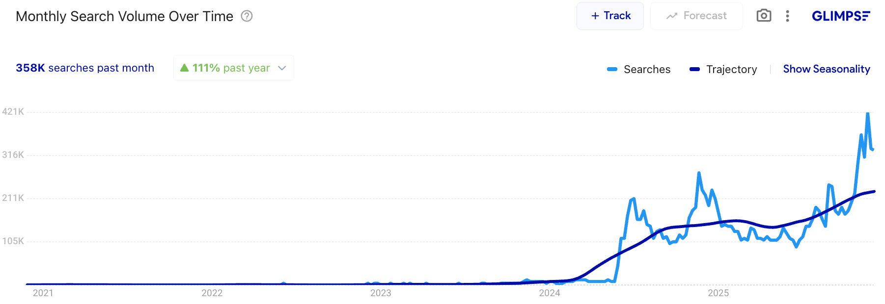
Not all brands are riding the same wave. While the overall category shows upward momentum, individual brand performance tells a more complex story. Rhode Beauty, Hailey Bieber’s buzzy skincare-meets-makeup brand, has seen its blush searches skyrocket 115% year-over-year (358K searches past month).
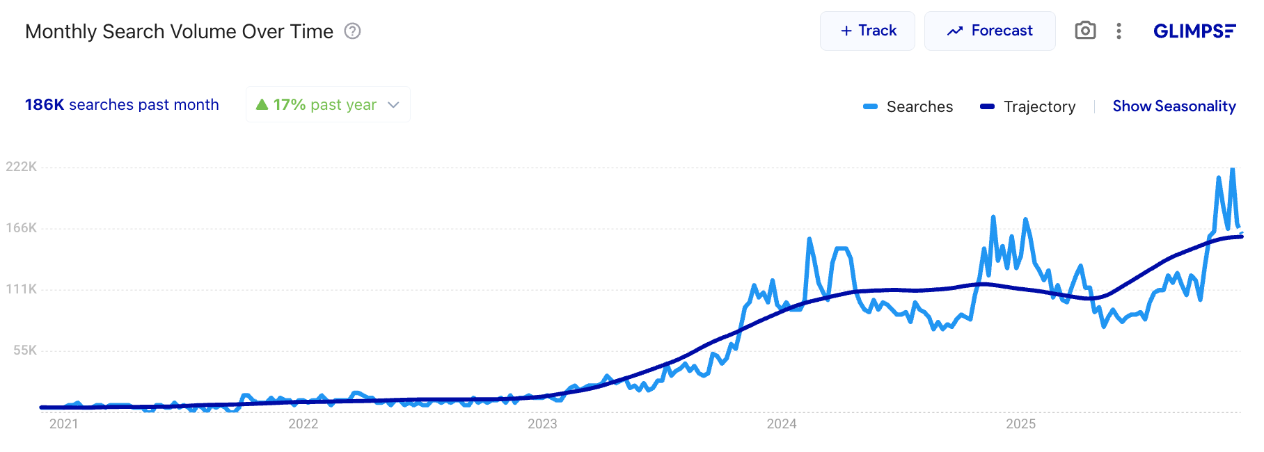
Similarly, Patrick Ta’s luxury blush searches have climbed 17% (188K searches past month).
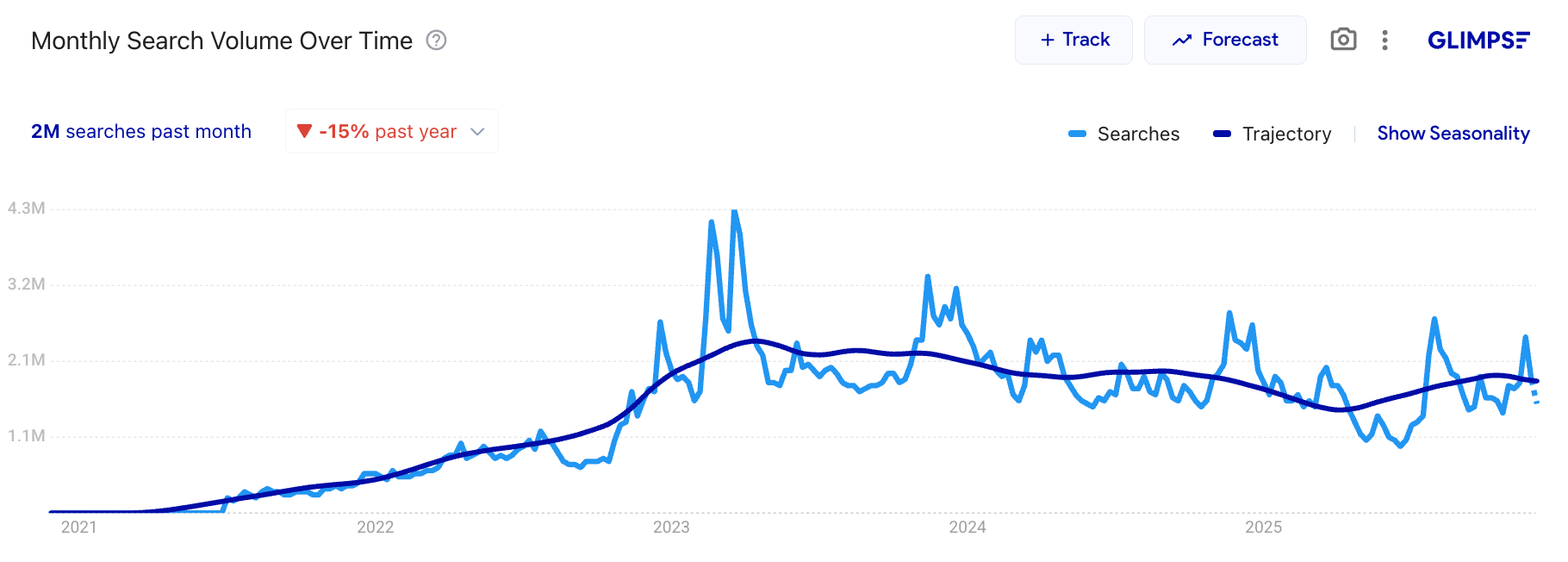
Meanwhile, Rare Beauty (despite dominating Ulta’s shelf space with 73 SKUs) shows a -15% decline in search interest (although still sitting at a hefty 2M searches past month), suggesting even category leaders aren’t immune to market saturation fatigue.
We are approaching a tipping point. The steady upward trajectory from 2021 through mid-2024 has begun to plateau, with recent months showing the kind of volatility that typically signals market maturity. When a category balloons from hundreds to thousands of SKUs in just a few years, oversaturation becomes inevitable. But saturation doesn’t mean opportunity has disappeared, it means the rules have changed.
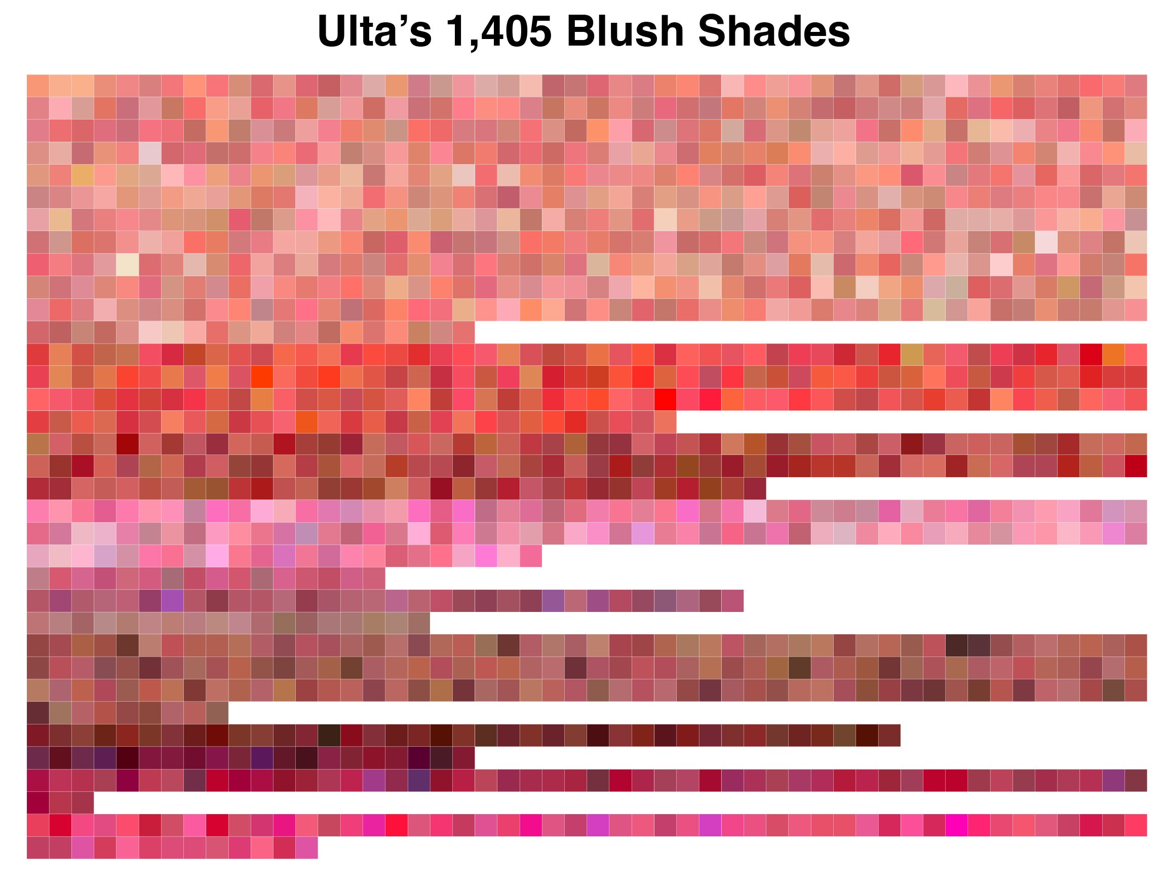
In this piece, we analysed the HEX codes of all 1,405 HEX codes at Ulta to answer if white space still exists. Once we extracted these codes, it quickly became clear that raw data alone wouldn’t tell the full story.
So we brought in an expert. Rachel Bilu of Colour Lab Stylist, a professional colour analysis service (and fantastic TikTok commentator). Rachel helped us identify the most over-served, and underserved, colour seasons in the current market, bust the “universally flattering” myth, and uncover insights into what’s next for the peak blush phenomenon.
Today’s analysis was written in partnership with the brilliant Micah, a data-obsessed product manager by day and skincare creator by night. When we got chatting in the DMs we knew we had to join forces. Shoutout to Micah for making this piece possible!
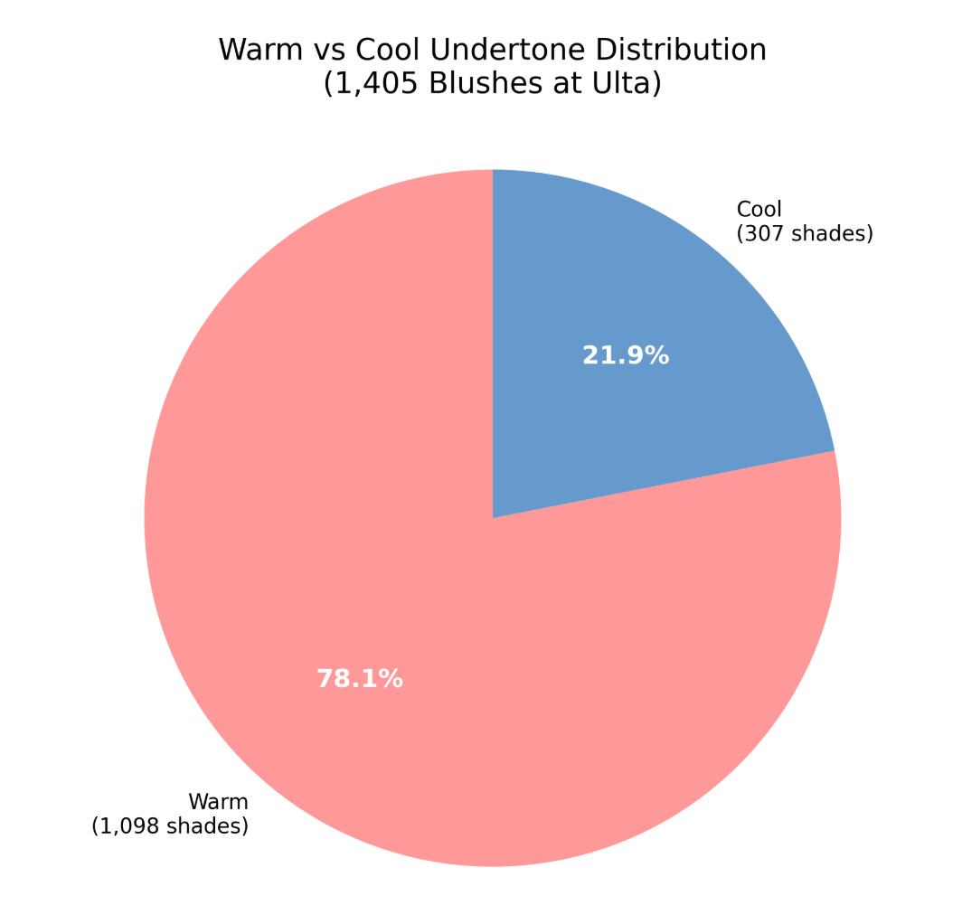
Blushes by Undertone
Blush’s explosive growth mirrors the rise of colour analysis on social media, where "colour season" content has become the lingua franca for personalised beauty recommendations. Despite consumers becoming more sophisticated about undertones and seasonal palettes, brands seem to be doubling down on the same narrow spectrum.
Across all 77 analysed blush-selling brands, the market leans incredibly warm: think peachy pinks, rosy corals, and terracottas. Still, it’s slightly more balanced than other makeup categories like bronzer, where consumers with cool and olive tones notoriously have issues with all products leaning warm or orange.
To dig a little deeper and bring some order to the chaos, we mapped each product’s HEX code to a corresponding colour analysis season. HEX codes are essentially the DNA of colour, capturing the precise mix of red, green, and blue that creates a shade. By decoding each one, we could pinpoint exactly where brands are clustering and which colour territories remain underserved.
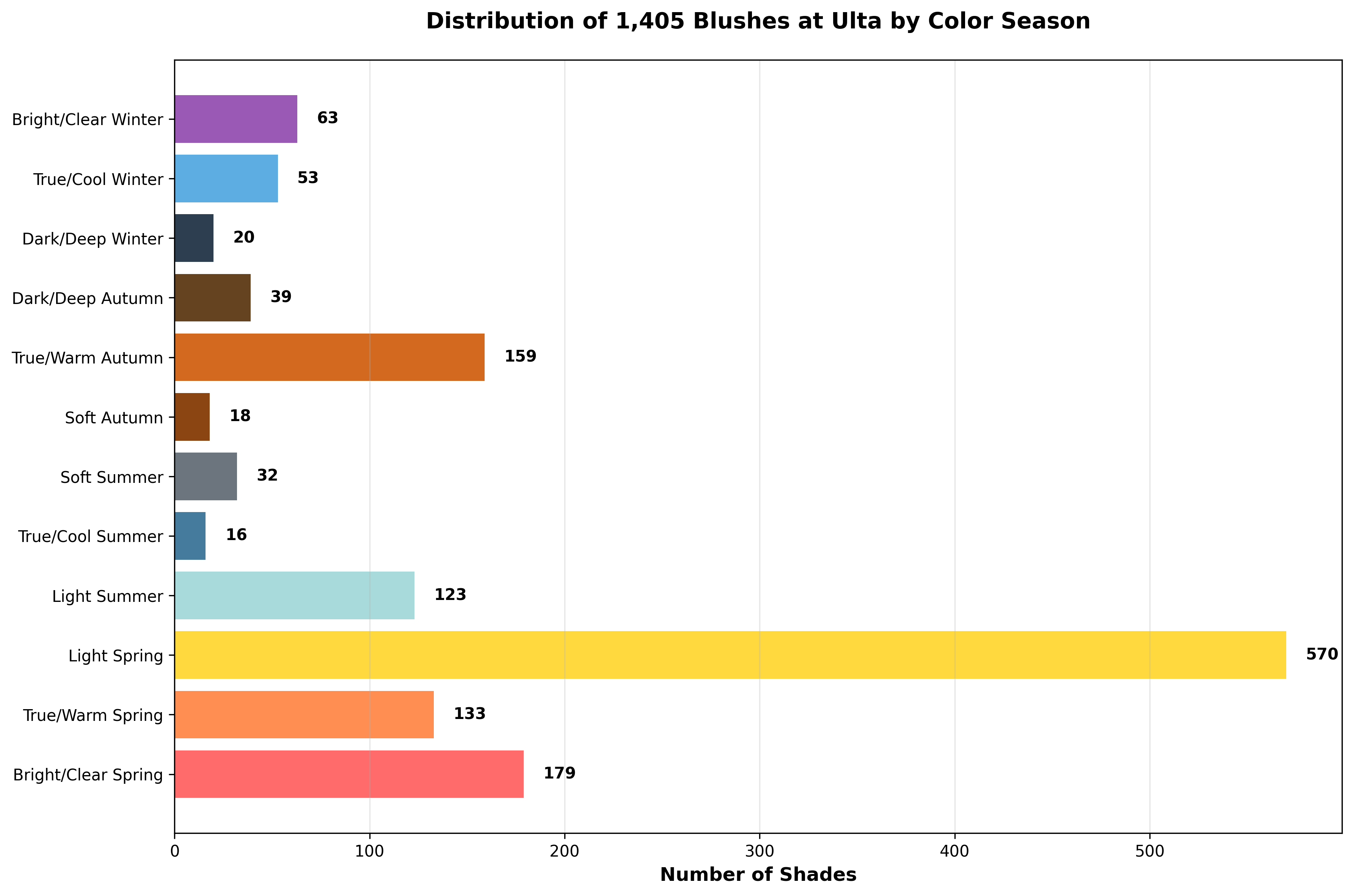
Unsurprisingly, the data validates what we'd all been thinking: the market is dramatically skewed toward lighter tones, Spring seasons specifically. Light Spring dominates at 570 shades (40% of the market), a clear oversaturation point. Combined with Bright/Clear Spring (179) and True/Warm Spring (133), Spring seasons command nearly 63% of all blush offerings.
Texture, Pigment, and Inclusivity
But HEX codes only tell half the story. With Rachel’s insight, we learned blush isn’t just about hue (warm vs. cool). It’s also about chroma (how soft or bright a colour appears) and value (how light or dark it is).
She also explained that brightness and contrast tolerance also play a role: softer blushes tend to flatter those with lower contrast between skin, hair, and eye colour, while brighter blushes suit higher-contrast complexions that can handle more vivid pigment without being overwhelmed. In other words, whether a shade looks “natural” or “loud” isn’t just about colour, it’s about how your colouring meets it halfway.
There is another complication with the impact of pigment percentages. The more pigmented a blush is, the better it shows up on deeper skin tones, but also, the more narrow it becomes in terms of colour season. On the flip side, sheerer formulations, like tints, tend to flatter a wider range of seasons, but can lose visibility on deeper skin tones.
So yes, the industry is definitively over-indexed on Spring shades, but blush inclusivity is fundamentally more complex than foundation. Foundation is binary: it matches, or it doesn’t. Blush operates on multiple variables simultaneously—undertone, depth, saturation, and pigment payoff all determine whether a shade flatters or falls flat.
Which makes this analysis, and shopping for blush online, infuriatingly difficult. Digitally, we can only see colour. There’s no standardised pigment intensity scale. No way to gauge whether a formula is sheer-buildable or high-impact from a swatch photo. You’re left inferring texture, payoff, and wearability from brand copy and the limits of your own makeup literacy. The industry has given consumers sophisticated language around undertones and seasonal colour theory, then failed to provide the product transparency needed to actually use it.
The solution isn’t just “more shades.” It’s diversification across two axes: skin tone depth (light to deep) and colour season (cool/muted to warm/bright). Every complexion level needs representation across the seasonal spectrum. Anything less is just performative expansion, brands checking an inclusivity box without actually solving for the complexity they’ve created.
Brands Getting It Right
Of the three least-represented seasons (soft autumn, dark/deep winter, and true/cool summer), two brands stood out as having the most options:
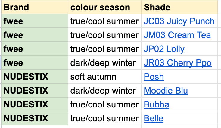
With fwee being a Korean brand (and the makeup counterpart to sister skincare brand numbizin), you wouldn’t think they would be one of the most inclusive. K-beauty is notorious for catering to a small subset of skin tones, but this data suggests a shift.
In addition to having the most options for the bottom three seasons, NUDESTIX came in highest for representation across seasons, they have shades for 11 out of 12. The only one they’re missing a shade for is bright/clear winter.
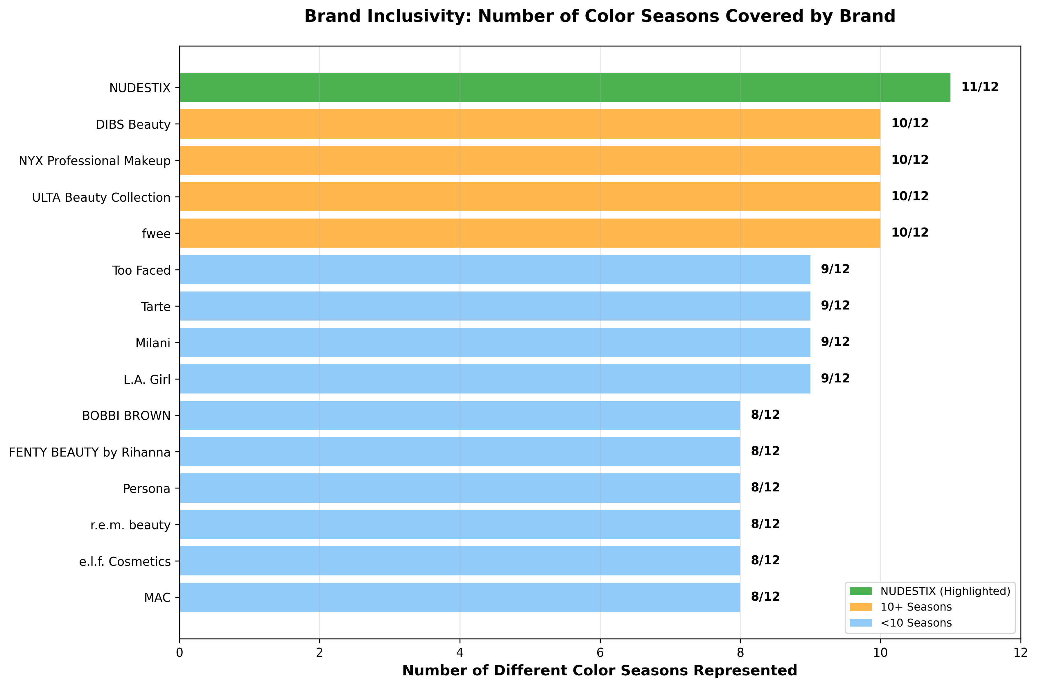
What’s notable here isn’t just who’s doing it right, it’s why. Both NUDESTIX and fwee built their brands around blush. It’s not a line extension or a trend response; it’s foundational to what they do. And that focus shows up in their shade architecture. When you’re known for blush, you can’t get away with eight variations of the same peachy-pink.
Compare that to the brands flooding Ulta’s shelves with Spring-heavy launches. For most of them, blush is an easy win, a way to capitalise on the current moment without the investment required to serve the full spectrum. The brands that have blush as a core part of their business are the ones solving for its complexity.
The Myth of the “Universally Flattering” Blush
Rachel put it best: there’s technically no such thing as a universally flattering shade. Colour harmony depends on an individual’s undertone, contrast, and chroma—not marketing copy. Neutral pinks and soft red-leaning hues appear to be the most wearable across tones, but in practice, even those pull warm or cool depending on the wearer.
Interestingly, two of the most iconic blush shades, NARS Orgasm and Charlotte Tilbury Pillow Talk, both fall into the Light Spring category, meaning their warm, bright, slightly peachy-pink tones flatter a narrower slice of undertones than their universal reputation suggests. Their cult status isn’t about universal appeal; it’s about reaching market saturation at the exact moment Light Spring became the default beauty standard. These shades work beautifully for their intended colour season, the problem is the industry convinced everyone else they should work too.
If brands want to stand out in the current blush boom, this data points to a clear opportunity: lean into the underserved colour seasons.
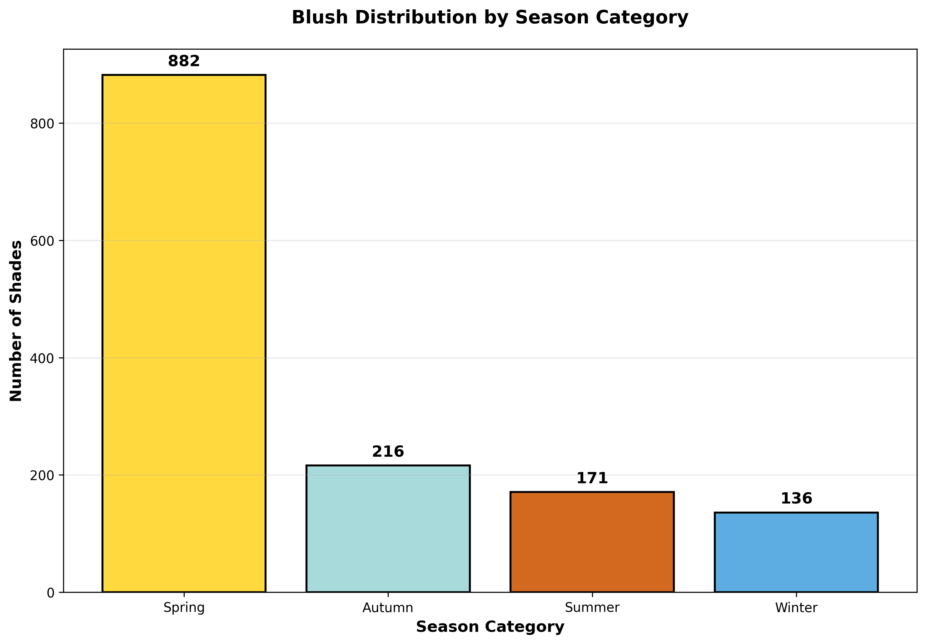
Cooler, muted, and deeper shades represent the most underserved territory in the blush market, yet colour analysis has never been more mainstream. Spring seasons command 882 shades while Winter gets just 136, a 6.5x disparity. Zoom in further and the gaps become chasms: Light Spring has 570 options compared to True/Cool Summer’s 16, a staggering 35x difference.
Consumers aren’t just asking “what’s trending?” They’re asking “what’s my season?” They’re learning the language of undertones, contrast levels, and chroma.
 Tiktok failed to load.
Enable 3rd party cookies or use another browser
Analysing 1,405 blushes taught us the market isn’t short on colour. It’s stuck in a warm-toned feedback loop. The brands that win the next phase of this boom won’t be the ones launching another peachy-pink. They’ll be the ones who looked at this data and saw opportunity where others saw complexity.
If you’re interested in learning more about what we are building with Unfiltered, feel free to shoot me an email at lily@barefaced.media. Otherwise, you can connect with Barefaced across all platforms here.
 | A guest post by
|
It’s especially frustrating as a summer who leans toward the dark end of the spectrum. I need a sheer muted berry for it to look natural. So many companies think muted means adding white and making it brighter instead of adding a touch of yellow to mute the purple and keep it the same value.
Is there anywhere to see the database of blush shades? I'm a Soft Summer it is tough out there!!!