Beauty products don’t have the luxury of taking on a new visual identity with every release. Unlike fashion, where fast newness cycles allow each drop to tap into whatever colour is capturing the zeitgeist, beauty brands have to be far more deliberate. That’s what makes colour such an interesting lens for analysing beauty branding.
After my last report on beauty copywriting and brand archetypes, I wanted to return to the topic of branding, this time focusing on one of the many non-verbal brand cues: colour. Specifically, how brands use colour to build out their brand worlds.
For this piece, I set out to explore how beauty brands craft identity through colour by analysing the hero images of 137 brands. I scraped the images from a popular retailer and developed a script to extract the hex code for each pixel, tally the colour counts, and ultimately determine the most dominant colour per brand.
In the report below, we’ll first explore how beauty brands use colour in world-building, then look at the trends and commonalities among those dominant colours to help beauty professionals better understand how competitors use colour to communicate values, tone, and positioning.
The full analysis, interactive graphs, and raw data are available behind the paywall.
P.S. Branding reports seem to really resonate. There’s been a noticeable spike in paid subscriptions, so welcome, all! If this is an area you’d like me to keep exploring, drop a like, leave a comment, or get in touch.
How Beauty Brands Use Colour
The most obvious way beauty brands use colour is in their packaging. Since the rise of the shelfie, a photo taken of a bathroom shelf and shared online, there has been a huge shift in the importance of packaging. The visual identity of a brand now has to live beyond environments where brands have visual control, like a retail gondola or a brand’s own website.
However, I didn’t want to focus on packaging trends this week—though that report is in the works. Instead, I aimed to explore how brands use colour to build their brand worlds.
That’s why, for this piece, I collected the ‘hero images’ for each brand from a popular retailer. These are the single images a brand selects to represent themselves on a site that strips away much of their identity and places every product on an almost level playing field. It’s a rare moment where a single image has to do all the talking, without the help of motion, copy, or context.
Method
At uni recently, I learnt about image processing—something I’d always avoided out of intimidation, but turns out, it’s not as hard as it looks. (A recurring theme I have found in learning computer science.)
Once I had all the hero image URLs, I converted each image to RGB and wrote a simple function to count how many pixels there were of each colour. From there, I ranked the colours to find the most dominant colour in each image.
In every case, this method was accurate—but not always insightful. For example, Vyrao’s hero image shows a selection of their colourful fragrance bottles, so the most dominant colour was simply the bottle that is furthest forward in the shot.
In many cases, the most dominant colour was the background colour. While this might feel boring, from my time working in-house on content and production, I can say with full confidence that those background colours are not random.
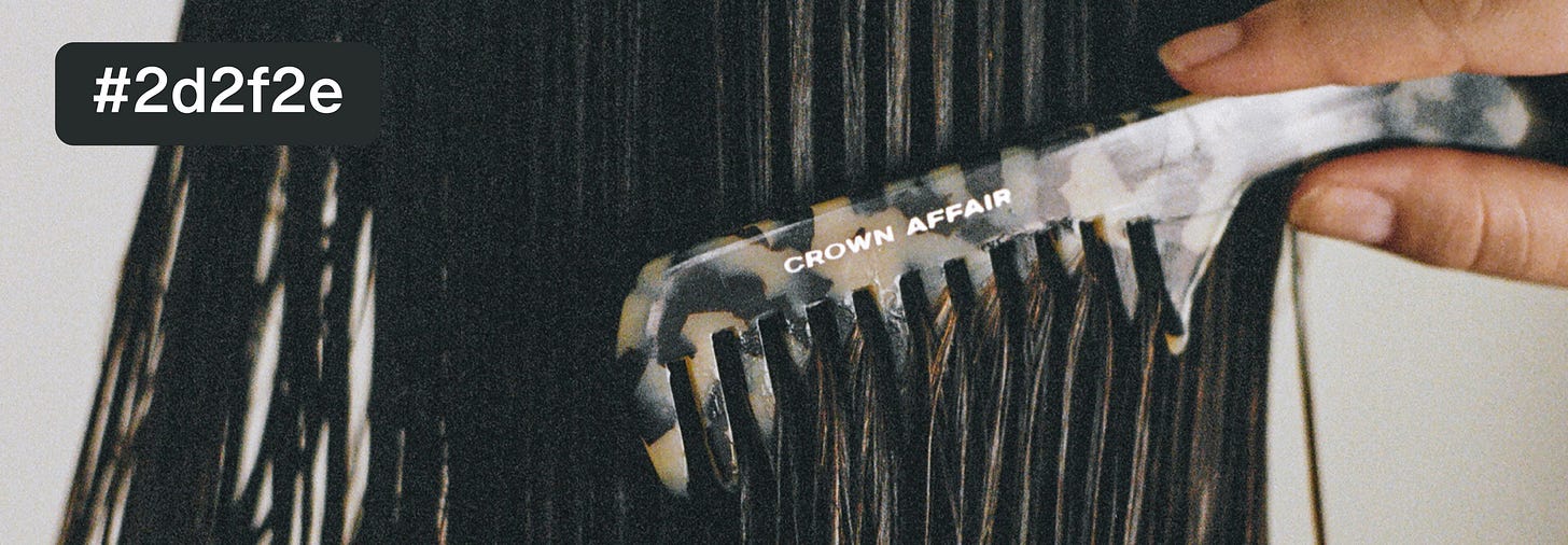
The throughline here is that the hero image always reveals something about how the brand perceives itself. Take Crown Affair, for example. A brand that has cultivated a chic, feminine identity through a strong focus on visual production. Their packaging, creative direction, and tone are all carefully crafted.
When it comes to their hero image, the wide-frame shot they use on this retailer’s site has to encapsulate their entire brand world in a single frame, and it does. The symmetry is deliberate. The most dominant hex code, #2d2f2e, a deep, almost-black grey, mirrors their packaging and reinforces their positioning.
Most Dominant Colours
After trialling countless graphing packages, tools, and bits of software, I ultimately had to do the visual analysis manually. I could not, for the life of me, figure out a way to filter the colour groups based on hex codes. So, I leaned on my Cert IV in Graphic Design and grouped them by eye instead.
With that in mind, here are the most dominant colours for each brand’s hero image.
As with most of these reports, the raw data alone doesn’t provide much insight. Questions like why so many brands gravitate toward various shades of grey, or why only a handful use bold, bright colours, remain unanswered. So, let’s dive into the most prominent colour groups and explore the patterns that emerge.


